Aakshat
Oct 24, 2025
The Hidden UX of Calm: How Design Quietly Soothes You

The Calm You Didn’t Know Was Designed
You’ve probably never thought about it, but your favorite apps are quietly designed to keep you calm.
The round corners, the soft gradients, the gentle animations when something loads — none of it is accidental. It’s a silent orchestra of design decisions made to comfort your nervous system while your brain pretends it’s in control.
As a UX designer, I’ve always found this fascinating. We don’t just design for usability — we design for emotional safety. Every pixel, color, and motion contributes to how your body feels while your mind interacts. Calm isn’t a mood; it’s a product feature you were never told about.
The Psychology of Softness
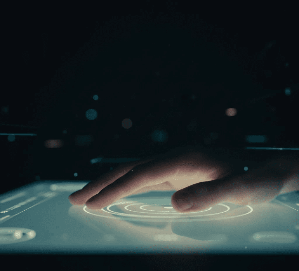
There’s a reason buttons are rounded, not sharp. Harsh corners trigger micro-stress responses — our brains evolved to associate angles with danger. But circles? They’re safe, familiar, human.
Your phone is a world of softness: smooth edges, slow fades, balanced spacing. Each detail is a quiet reminder that you’re in control — even when you’re not.
Designers use these cues deliberately. We call it affective design — crafting emotion through shape and motion. And when it’s done right, you don’t notice it. You just feel… okay.
The Rhythm of Calm
The best part? You rarely notice it.
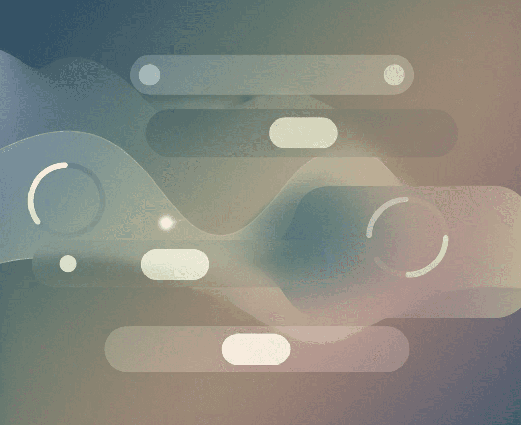
Good interfaces breathe. They expand and contract, fade in and out, with timing calibrated to match human emotion. The speed of an animation, the delay before a button lights up, the way a menu slides instead of snapping — all of it creates rhythm.
When an app moves too fast, it feels anxious. Too slow, and it feels lazy. The sweet spot is somewhere between 180 and 300 milliseconds — the tempo of a sigh. That’s the UX of trust.
You don’t consciously register it, but your body does. It’s like someone’s speaking your emotional language fluently, without saying a word.
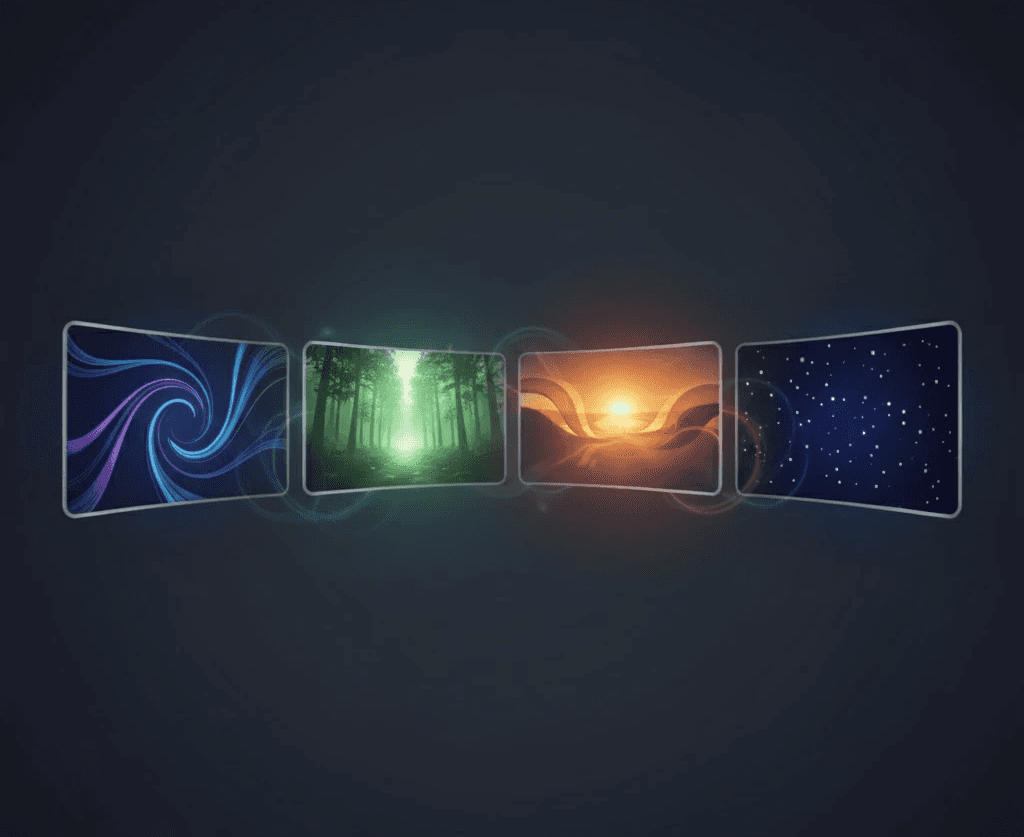
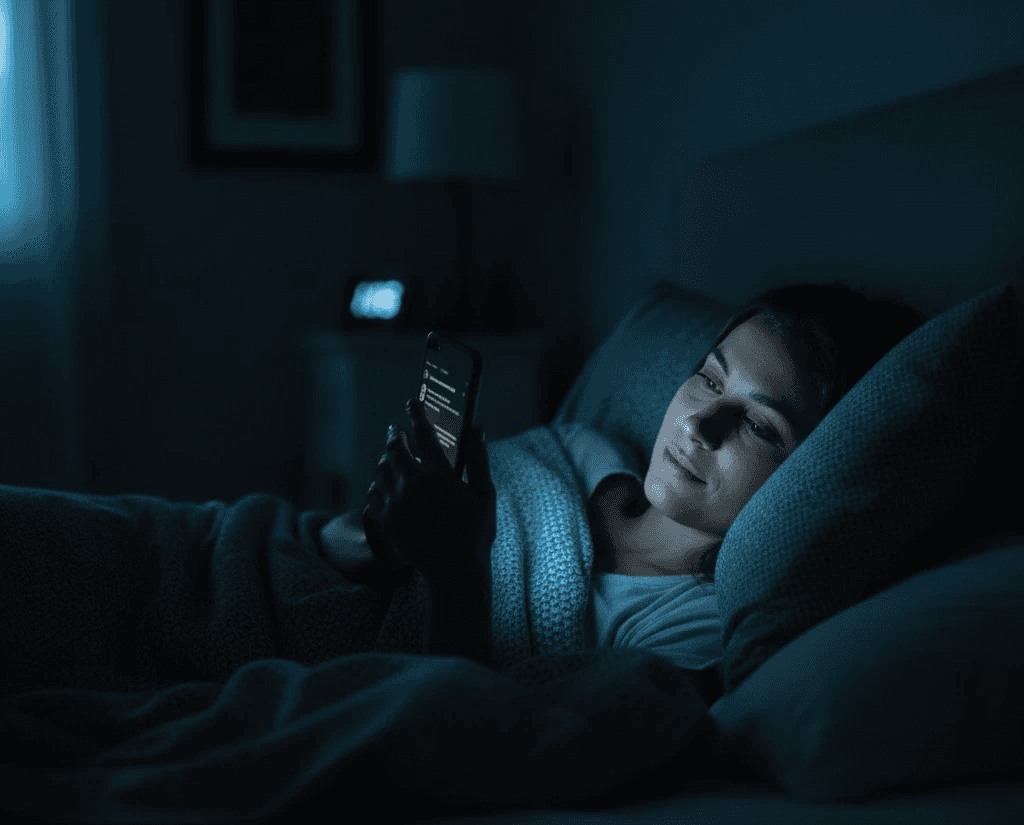
The Color of Ease
Ever noticed how most modern apps have drifted toward muted palettes? Gone are the neon blues and jarring reds of early interfaces. Instead, we see warm neutrals, soft whites, gentle blues.
Color psychology plays a silent role in UX calm. Blue lowers blood pressure. Neutrals reduce cognitive load. Even the subtle brightness shift between day and night modes mimics your circadian rhythm — teaching your brain when to stay alert and when to rest.
As designers, we don’t just paint pixels; we paint moods. The goal isn’t to impress you — it’s to regulate you.

The Invisible Design of Peace
The most beautiful thing about calm design is that you never notice it working. It’s like background music in a café — invisible, yet essential. It guides your emotions without demanding attention.
When design truly understands you, it stops being about control and starts being about care. That’s what great UX really is — emotional ergonomics. It’s not just about making things easy to use. It’s about making you feel safe while using them.
In a world that’s constantly loud, distraction isn’t the enemy. Anxiety is. And sometimes, the most powerful technology isn’t the one that gets your attention — it’s the one that quietly gives it back.