Full Fledged Platform
Travel
Tralendr
Tralendr is crafted by a small but passionate team of travel enthusiasts who believe that planning your trip should be as rewarding as the journey itself.

Service
Design
Tools Used
Figma, Adobe Illustrator
Completion Timeline
1 Month

Personas & User Insights
The real people behind our app. By understanding their travel habits, challenges, and what they want, we made sure our design helps solve their problems and makes planning trips a breeze.

Logo
So, the plan was to create something that captures the essence of traveling to various spots around the world based on itineraries. This made it way easier to brainstorm ideas. I ended up with two versions using the same design elements: a Plane and a Location Icon or a Globe Icon. But honestly, Globe feel a bit outdated, like something you'd see in Internet Explorer!
Version 1

Version 2

So, the client initially went with "Version 1," which honestly felt more like a "Windmill" icon than a travel icon. I was rooting for "Version 2" instead. But after I explained why "Version 2" was the better choice, they switched their minds! It turned out the logo process didn’t take as long as I thought, and we wrapped it up in just 2 days.
Now, Analysis of the situation above along with the relevant psychological concepts:

Here's a casual rundown of the psychological concepts that apply to this situation.

These psychological principles highlight how design choices and communication strategies can significantly impact client decisions and perceptions in branding contexts, such as logo selection.
Picking a Color for the Logo
So, after wrapping up the logo design, we needed to choose a color to really make it pop. The client suggested using Instagram's color palette, but honestly, I wasn't a fan since it doesn't really fit the vibe we're going for.

Then, I had this lightbulb moment about using the colors of the sky—like those beautiful shades you see when you're flying.

I thought a gradient from morning sunrise to evening sunset would be perfect. So I came up with :
But the client wanted something a bit more vibrant, so we experimented a bit and came up with some lively shades. In the end, they went with the second version we presented because it matched their vision better.

And that's a wrap! We’ve locked in the logo and are moving on to the High Fidelity Wireframes for Mobile.
High Fidelity Wireframes
We had a solid idea of what the app would do and how users would navigate it, so during brainstorming, we really focused on making the screens user-friendly and cutting down the time it takes to book an itinerary. We ended up with a few drafts for our first version.
The Initial Draft For The Two Major Screens

Home Screen V1
The whole idea is that users usually don’t book more than 3 or 4 trips at a time. So, we designed this setup where you can easily scroll through your "Ongoing, Upcoming, and Past Itineraries" and keep track of all his bookings.
Itinerary Screen V1
The whole idea is that users want to see their entire calendar in one quick look and pick the dates they’re traveling. This makes it super easy to check out the itinerary for any specific day without having to scroll endlessly.

The Second Draft with Improvised Home and Itinerary Screen, with an addition of a Modification and Rearrange feature.

Home Screen V2
We've revamped the home screen! Now, all the itinerary options are at the top, and user can scroll through endless itineraries under each category. This makes it super easy to keep track of all the bookings in one spot. Plus, there's a handy status bar for each itinerary, so user can see where things stand at a glance. Switching between the four categories is a breeze!
Itinerary Screen V2
We heard users! Now, they can easily tweak their requests and rearrange their itinerary right on the screen. We’ve also moved the travel calendar to the top, so switching between dates and checking out events is a breeze. Just tap on any date to jump straight to its events. No fuss—just one click and they’re good to go!
The Result
The Rearrange Screen
For this screen, we tried 5 different variations :

Version 1
In this version, we aimed to make it super easy for users to shuffle their days and locations around by dragging and dropping cards. But we hit a few bumps along the way. For starters, if users wanted to know more about an event, like when it starts, there was no way to add that info. Plus, managing everything could feel a bit overwhelming with all the clicks involved, making it hard to keep track of everything at once. And what if someone accidentally dragged a day to the wrong spot? That could definitely lead to some confusion!
So, we tried few more variations

Version 2, 3 & 4
In this version, we ditched the tabs between dates and events because the stakeholders wanted to change things up. The goal was to make it easier for users to change the date and time while really emphasizing the timings since they’re super important for events.
The idea was that users could just tap on the timing and adjust it as needed, but honestly, it looked pretty messy. So, I moved on to V3, where I tried to get rid of that underlined timing, which didn’t look great either. I still wasn’t happy with it, which led me to V4. That version finally started to look visually organized and much better than the previous ones.
In V4, we debated whether to add a drag-and-drop feature for the cards, like we had in V1. It sounded good at first, but when you think about it, it could be really frustrating.
Why? Because if I wanted to move a card from Day 1 to Day 7, I’d have to scroll all the way down and hold it until the events auto-scroll to that day, which is definitely annoying.
I explained this to the stakeholders, and we decided to stick with the current version for now. But I still felt something was off, mainly because the date and time didn’t feel as significant as they should. That’s what pushed me to create V5.
The Final Version

Version 4 vs Version 5
Here, I switched the date and time options from the bottom to the top of the card. You know how our eyes naturally scan from top to bottom? This way, when users want to change the date or time, they’ll see both options right away. Some might think it’s a small tweak, but it really made a difference in the user experience. Plus, this version got the thumbs up from me and the stakeholders, which helped us wrap up all the key screens in the app!
Few Basic and Universal Screens
Here are a few screens that pretty much speak for themselves—they’ve been tried and tested over a thousand times in the digital world!

Moodboard
Before diving into the UI, it's awesome to have some inspiration to kick things off. Here are a few examples from my mood-board to spark some fresh ideas!

User Interface
Once we wrapped up the high-fidelity wireframes and finalized the screens, we dove into some cool research for inspiration. That’s how we landed on the UI for our mobile app!
Picking Up the Primary Color and Secondary Color
Here are the color options we got from the client’s palette. We need to choose our Primary and Secondary colors from these!

I chose orange as the primary color and blue as the secondary color for the app because they work perfectly together to create the right vibe.
Orange is energetic, adventurous, and grabs attention—it’s great for inspiring users to explore and take action.
Blue, on the other hand, balances it out by adding a sense of trust, calmness, and reliability, which is super important for something like a travel app where people need to feel secure.
Together, they create a vibrant yet trustworthy design that feels exciting but still dependable. Plus, they’re complementary colors, so they naturally create a visually appealing contrast that grabs attention and feels harmonious.


Defining Key Elements, Design Choices and Impact
Homepage

Itinerary

Rearrange

Landing Page
Once I wrapped up the mobile app's UI, I jumped into creating a fun and inviting landing page. I had loads of ideas and tweaks, plus I put together a mood-board to guide the web design.
Moodboard

Hero Section Versions
I started off by designing a few hero sections because they’re super crucial! They really make or break whether someone sticks around on your site in those first few seconds.

The initial draft for landing page
After playing around with a few ideas, I still wasn’t feeling it. So, I thought, why not go for something new? I got inspired by a traveler's book—like those where people take photos of their favorite places and write the names underneath. To spice things up, I threw in a simple world map in the background and added a couple of planes flying by to really nail that travel vibe. That’s how I came up with the first draft of the landing page.
I kept this version pretty simple and subtle, just like the first draft. When I showed it to the stakeholders, they loved the concept! They gave me some feedback and a few extra ideas, which helped me create the second and final version of the landing page, along with its mobile-friendly version.
The 2nd and the final draft for landing page
After tweaking the header a bit more based on what the clients wanted, I ended up with a clean and simple layout that looks great.

The Form Components
On our landing page, we’ve set up a cool 3-step wizard form to keep things simple and avoid overwhelming users with too much info at once. I whipped up a master component with different variations to showcase the form's UI in the Prototype version.

Admin Panel Design
Now that we've wrapped up the user side, let’s dive into the admin panel. This part can be pretty tricky for managers and stakeholders to handle, but I’m excited to share how I made it super user-friendly for admins!
The main job with the admin panel dashboard is to keep an eye on these six key metrics

Setting Up Master Data
To set up the app's master data, we kicked things off by adding a feature that lets you create categories and sub-categories. This way, users can easily see which category and sub-category an event belongs to!
Adding Category
This page makes it super easy for admins to add a new category—just type in the name at the top and hit 'Add' to save it. We decided to skip the delete option because, let’s be real, we all mess up sometimes. Picture an admin deleting a bunch of categories, thinking they won’t need them, only to realize later that they actually do.
It’s such a pain to recreate them one by one or start fresh with subcategories. To dodge that hassle, we’ve got a handy switch instead of a delete button. If you don’t need a category for now, just flip the switch off, and when you want it back, flip it on again. Simple as that! Plus, users can edit and rename their categories whenever they want.

Adding Sub-Category
Honestly, this is pretty straightforward. Once we add categories in the "Add Category" tab, we can pick from those categories and add subcategories if we want. We even included a delete button because subcategories can get a bit messy. If you add too many, it can be a hassle to manage. The cool part is, if you accidentally delete a subcategory, it’s no big deal! The admin won’t have to stress about re-adding it, unlike with categories where a mistake can lead to a lot more frustration.

Adding Itinerary
On this screen, admins can easily add itineraries to the master data. Just type in the city or event name in the "Search Location" field, and all the details will be pulled in from Google Maps API, including Place Name, Address, City, and Map Directions. If the info isn’t quite right, feel free to tweak it!
Admins just need to pick a category and sub-category from the dropdowns in the "Add Category & Sub-Category" section above. Then, they can choose a price range from our five pricing categories (from budget-friendly to luxury) based on the event type or location.
If needed, they can also add a reservation link for places like theaters, restaurants, or hotels. Finally, they can include a short description of the event or location, along with any notes to help guide users on their journey, plus an image that will show up on the itinerary cards in the mobile app.
Admins can save and edit this info anytime by selecting it from the "Item List" tab, where all added itineraries are stored.

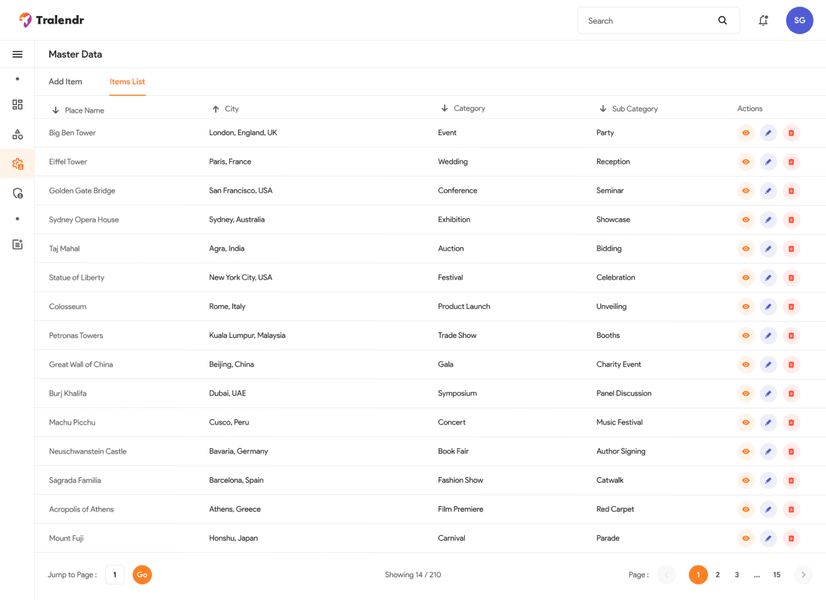
List of Saved Itineraries
After saving the itinerary, user can easily "View, Edit, or Delete" it right from the list. This list is linked to the master data, so any changes user make will update the master file instantly. User will see the names of places, cities, categories, and subcategories (if there are any), along with action buttons. Plus, user can sort the list using the ascending/descending filter arrows next to the column names.
Itineraries Management
Users can easily switch between "Requested," "Published," and "Modifications Requested" to keep tabs on their records.
In the first tab, called Requested Itineraries, users can check out all the itineraries their customers have asked for. They’ll see all the details provided by the customers, plus there’s an "ADD" button that lets admins jump right in and start creating an itinerary to publish.

Create Itinerary
When user hit the "ADD" button, they'll see a library of itineraries they've put together in the master data. The start and end dates will automatically pull from the customer's request, but the user can tweak them if needed. User can search for locations in the right-hand column and easily add or remove items from the itinerary list.
This way, user won't have to re-enter the same details for every customer, saving you a ton of time! Once they've added an event or location, they can pick a specific time from the dropdown or rearrange the locations and events using the handy rearrange icon next to the location cards, and then just publish it!

Published Itinerary
In the second tab, named Published Itineraries, user can check out the published itineraries, each with its own "Unique ID," and user have the options to View, Edit, or Delete them.

View Itinerary
Admins can check out how the info will appear for customers on the mobile app using a view-only page.

Requested Itinerary
In the third tab called Requested Modifications, user can see all the changes customers have asked for on their itineraries, each with its own "Unique ID." User can choose to View, Edit, or Delete any of them!

Admin Access
Super Admins can easily add or remove multiple admins by entering their name, email, and admin type. Based on what the client shared, we only need two roles for now: admin and super-admin. But if they decide to expand in the future, we can totally accommodate more roles like Contributor, Moderator, Viewer, Editor, and more—all within the current design!

Push Notifications
And that's a wrap! The last screen of the admin panel lets user send notifications to all their registered customers about their itineraries or any changes. All user need to do is enter a catchy title and a quick message, and with just one click, everyone gets the scoop on their updates!

Collaterals
We whipped up some cool banner and feature images for the PlayStore and Appstore, sticking to their design guidelines.
PlayStore Banner

PlayStore Featured Images
Appstore Banner

AppStore Featured Images

Projected Metrics
This part talks about who might use the app and how it can make money based on real market ideas. By focusing on frequent travelers, the app hopes to attract a large number of users while also bringing in good revenue through paid ads or partnerships. These projections give a glimpse into how the app can grow and succeed in the long run.
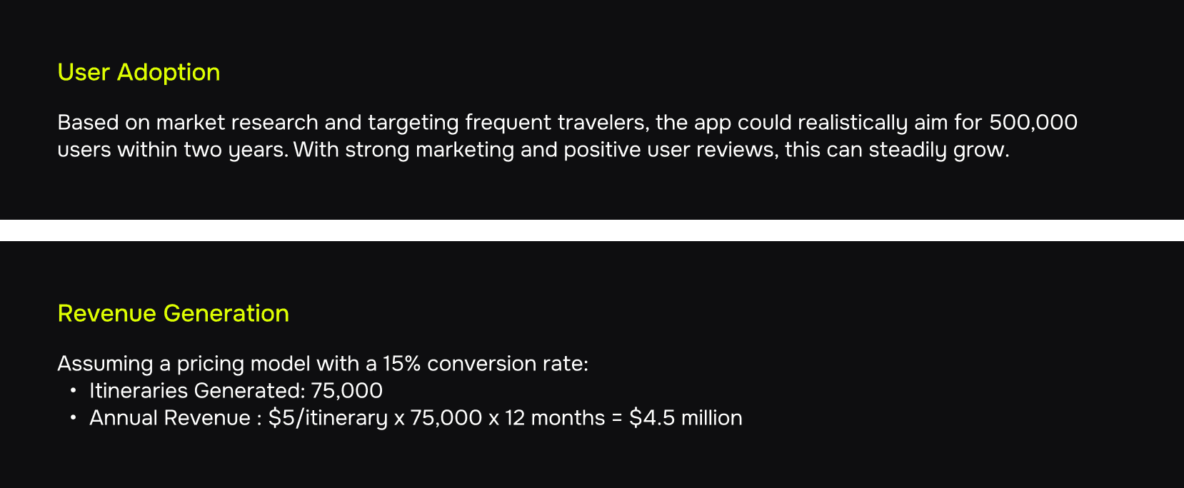
Additional revenue could come from strategic partnerships with hotels, airlines, and in-app ads.
My Learnings
Working on this project really showed me how much faster things can go when clients come prepared. For tight-budget projects or MVPs with looming deadlines, having clients do their homework upfront makes a huge difference. When they give us clear guidance or research from the start, it helps us make design choices quicker, saving time and energy. This way, we can iterate faster and deliver a solid product without stretching our resources too thin, which is super important in a fast-paced environment.
In retrospect, I am satisfied with the final outcome, but as a designer, I believe there is always room for improvement. Even when a solution feels satisfactory, revisiting it with a fresh perspective can often lead to better refinements.
That’s it from my side. I hope you like the overall presentation and find it useful.
Tralendr
Tralendr is crafted by a small but passionate team of travel enthusiasts who believe that planning your trip should be as rewarding as the journey itself.
Full Fledged Platform
Travel
Service
Design
Tools Used
Figma, Adobe Illustrator
Completion Timeline
1 Month
Other Projects
Tralendr
2024
Full Fledged Platform

MirAIe by Panasonic
2024
Mobile

Desktime
2024
Web
Tralendr
2024
Full Fledged Platform
MirAIe by Panasonic
2024
Mobile


Aakshat Paandey
AI Systems Architect & Investigative Storyteller | Designing intelligent systems, narratives, and human-AI interfaces


Explore
Let’s work together
Aakshat Paandey
AI Systems Architect & Investigative Storyteller | Designing intelligent systems, narratives, and human-AI interfaces

Explore
Let’s work together
Aakshat Paandey
AI Systems Architect & Investigative Storyteller | Designing intelligent systems, narratives, and human-AI interfaces

Explore
Let’s work together
Personas & User Insights
The real people behind our app. By understanding their travel habits, challenges, and what they want, we made sure our design helps solve their problems and makes planning trips a breeze.
Logo
So, the plan was to create something that captures the essence of traveling to various spots around the world based on itineraries. This made it way easier to brainstorm ideas. I ended up with two versions using the same design elements: a Plane and a Location Icon or a Globe Icon. But honestly, Globe feel a bit outdated, like something you'd see in Internet Explorer!
Version 1
Version 2
So, the client initially went with "Version 1," which honestly felt more like a "Windmill" icon than a travel icon. I was rooting for "Version 2" instead. But after I explained why "Version 2" was the better choice, they switched their minds! It turned out the logo process didn’t take as long as I thought, and we wrapped it up in just 2 days.
Now, Analysis of the situation above along with the relevant psychological concepts:
Here's a casual rundown of the psychological concepts that apply to this situation.
These psychological principles highlight how design choices and communication strategies can significantly impact client decisions and perceptions in branding contexts, such as logo selection.
Picking a Color for the Logo
So, after wrapping up the logo design, we needed to choose a color to really make it pop. The client suggested using Instagram's color palette, but honestly, I wasn't a fan since it doesn't really fit the vibe we're going for.
Then, I had this lightbulb moment about using the colors of the sky—like those beautiful shades you see when you're flying.
I thought a gradient from morning sunrise to evening sunset would be perfect. So I came up with :
But the client wanted something a bit more vibrant, so we experimented a bit and came up with some lively shades. In the end, they went with the second version we presented because it matched their vision better.
And that's a wrap! We’ve locked in the logo and are moving on to the High Fidelity Wireframes for Mobile.
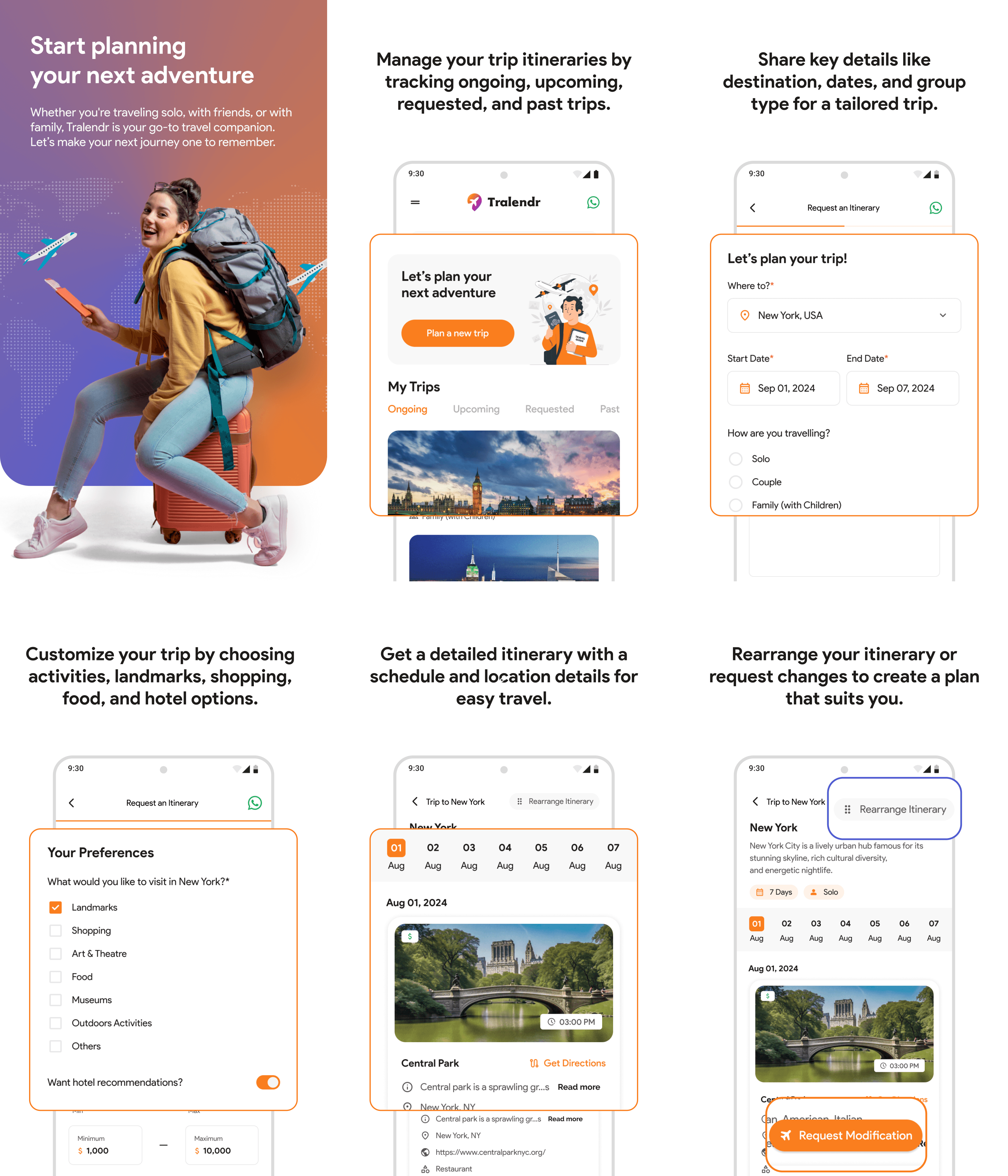
High Fidelity Wireframes
We had a solid idea of what the app would do and how users would navigate it, so during brainstorming, we really focused on making the screens user-friendly and cutting down the time it takes to book an itinerary. We ended up with a few drafts for our first version.
The Initial Draft For The Two Major Screens
Home Screen V1
The whole idea is that users usually don’t book more than 3 or 4 trips at a time. So, we designed this setup where you can easily scroll through your "Ongoing, Upcoming, and Past Itineraries" and keep track of all his bookings.
Itinerary Screen V1
The whole idea is that users want to see their entire calendar in one quick look and pick the dates they’re traveling. This makes it super easy to check out the itinerary for any specific day without having to scroll endlessly.
The Second Draft with Improvised Home and Itinerary Screen, with an addition of a Modification and Rearrange feature.
Home Screen V2
We've revamped the home screen! Now, all the itinerary options are at the top, and user can scroll through endless itineraries under each category. This makes it super easy to keep track of all the bookings in one spot. Plus, there's a handy status bar for each itinerary, so user can see where things stand at a glance. Switching between the four categories is a breeze!
Itinerary Screen V2
We heard users! Now, they can easily tweak their requests and rearrange their itinerary right on the screen. We’ve also moved the travel calendar to the top, so switching between dates and checking out events is a breeze. Just tap on any date to jump straight to its events. No fuss—just one click and they’re good to go!
The Result
The Rearrange Screen
For this screen, we tried 5 different variations :
Version 1
In this version, we aimed to make it super easy for users to shuffle their days and locations around by dragging and dropping cards. But we hit a few bumps along the way. For starters, if users wanted to know more about an event, like when it starts, there was no way to add that info. Plus, managing everything could feel a bit overwhelming with all the clicks involved, making it hard to keep track of everything at once. And what if someone accidentally dragged a day to the wrong spot? That could definitely lead to some confusion!
So, we tried few more variations
Version 2, 3 & 4
In this version, we ditched the tabs between dates and events because the stakeholders wanted to change things up. The goal was to make it easier for users to change the date and time while really emphasizing the timings since they’re super important for events.
The idea was that users could just tap on the timing and adjust it as needed, but honestly, it looked pretty messy. So, I moved on to V3, where I tried to get rid of that underlined timing, which didn’t look great either. I still wasn’t happy with it, which led me to V4. That version finally started to look visually organized and much better than the previous ones.
In V4, we debated whether to add a drag-and-drop feature for the cards, like we had in V1. It sounded good at first, but when you think about it, it could be really frustrating.
Why? Because if I wanted to move a card from Day 1 to Day 7, I’d have to scroll all the way down and hold it until the events auto-scroll to that day, which is definitely annoying.
I explained this to the stakeholders, and we decided to stick with the current version for now. But I still felt something was off, mainly because the date and time didn’t feel as significant as they should. That’s what pushed me to create V5.
The Final Version
Version 4 vs Version 5
Here, I switched the date and time options from the bottom to the top of the card. You know how our eyes naturally scan from top to bottom? This way, when users want to change the date or time, they’ll see both options right away. Some might think it’s a small tweak, but it really made a difference in the user experience. Plus, this version got the thumbs up from me and the stakeholders, which helped us wrap up all the key screens in the app!
Few Basic and Universal Screens
Here are a few screens that pretty much speak for themselves—they’ve been tried and tested over a thousand times in the digital world!
Moodboard
Before diving into the UI, it's awesome to have some inspiration to kick things off. Here are a few examples from my mood-board to spark some fresh ideas!
User Interface
Once we wrapped up the high-fidelity wireframes and finalized the screens, we dove into some cool research for inspiration. That’s how we landed on the UI for our mobile app!
Picking Up the Primary Color and Secondary Color
Here are the color options we got from the client’s palette. We need to choose our Primary and Secondary colors from these!
I chose orange as the primary color and blue as the secondary color for the app because they work perfectly together to create the right vibe.
Orange is energetic, adventurous, and grabs attention—it’s great for inspiring users to explore and take action.
Blue, on the other hand, balances it out by adding a sense of trust, calmness, and reliability, which is super important for something like a travel app where people need to feel secure.
Together, they create a vibrant yet trustworthy design that feels exciting but still dependable. Plus, they’re complementary colors, so they naturally create a visually appealing contrast that grabs attention and feels harmonious.
Defining Key Elements, Design Choices and Impact
Homepage
Itinerary
Rearrange
Landing Page
Once I wrapped up the mobile app's UI, I jumped into creating a fun and inviting landing page. I had loads of ideas and tweaks, plus I put together a mood-board to guide the web design.
Moodboard
Hero Section Versions
I started off by designing a few hero sections because they’re super crucial! They really make or break whether someone sticks around on your site in those first few seconds.
The initial draft for landing page
After playing around with a few ideas, I still wasn’t feeling it. So, I thought, why not go for something new? I got inspired by a traveler's book—like those where people take photos of their favorite places and write the names underneath. To spice things up, I threw in a simple world map in the background and added a couple of planes flying by to really nail that travel vibe. That’s how I came up with the first draft of the landing page.
I kept this version pretty simple and subtle, just like the first draft. When I showed it to the stakeholders, they loved the concept! They gave me some feedback and a few extra ideas, which helped me create the second and final version of the landing page, along with its mobile-friendly version.
The 2nd and the final draft for landing page
After tweaking the header a bit more based on what the clients wanted, I ended up with a clean and simple layout that looks great.
The Form Components
On our landing page, we’ve set up a cool 3-step wizard form to keep things simple and avoid overwhelming users with too much info at once. I whipped up a master component with different variations to showcase the form's UI in the Prototype version.
Admin Panel Design
Now that we've wrapped up the user side, let’s dive into the admin panel. This part can be pretty tricky for managers and stakeholders to handle, but I’m excited to share how I made it super user-friendly for admins!
The main job with the admin panel dashboard is to keep an eye on these six key metrics
Setting Up Master Data
To set up the app's master data, we kicked things off by adding a feature that lets you create categories and sub-categories. This way, users can easily see which category and sub-category an event belongs to!
Adding Category
This page makes it super easy for admins to add a new category—just type in the name at the top and hit 'Add' to save it. We decided to skip the delete option because, let’s be real, we all mess up sometimes. Picture an admin deleting a bunch of categories, thinking they won’t need them, only to realize later that they actually do.
It’s such a pain to recreate them one by one or start fresh with subcategories. To dodge that hassle, we’ve got a handy switch instead of a delete button. If you don’t need a category for now, just flip the switch off, and when you want it back, flip it on again. Simple as that! Plus, users can edit and rename their categories whenever they want.
Adding Sub-Category
Honestly, this is pretty straightforward. Once we add categories in the "Add Category" tab, we can pick from those categories and add subcategories if we want. We even included a delete button because subcategories can get a bit messy. If you add too many, it can be a hassle to manage. The cool part is, if you accidentally delete a subcategory, it’s no big deal! The admin won’t have to stress about re-adding it, unlike with categories where a mistake can lead to a lot more frustration.
Adding Itinerary
On this screen, admins can easily add itineraries to the master data. Just type in the city or event name in the "Search Location" field, and all the details will be pulled in from Google Maps API, including Place Name, Address, City, and Map Directions. If the info isn’t quite right, feel free to tweak it!
Admins just need to pick a category and sub-category from the dropdowns in the "Add Category & Sub-Category" section above. Then, they can choose a price range from our five pricing categories (from budget-friendly to luxury) based on the event type or location.
If needed, they can also add a reservation link for places like theaters, restaurants, or hotels. Finally, they can include a short description of the event or location, along with any notes to help guide users on their journey, plus an image that will show up on the itinerary cards in the mobile app.
Admins can save and edit this info anytime by selecting it from the "Item List" tab, where all added itineraries are stored.
List of Saved Itineraries
After saving the itinerary, user can easily "View, Edit, or Delete" it right from the list. This list is linked to the master data, so any changes user make will update the master file instantly. User will see the names of places, cities, categories, and subcategories (if there are any), along with action buttons. Plus, user can sort the list using the ascending/descending filter arrows next to the column names.
Itineraries Management
Users can easily switch between "Requested," "Published," and "Modifications Requested" to keep tabs on their records.
In the first tab, called Requested Itineraries, users can check out all the itineraries their customers have asked for. They’ll see all the details provided by the customers, plus there’s an "ADD" button that lets admins jump right in and start creating an itinerary to publish.
Create Itinerary
When user hit the "ADD" button, they'll see a library of itineraries they've put together in the master data. The start and end dates will automatically pull from the customer's request, but the user can tweak them if needed. User can search for locations in the right-hand column and easily add or remove items from the itinerary list.
This way, user won't have to re-enter the same details for every customer, saving you a ton of time! Once they've added an event or location, they can pick a specific time from the dropdown or rearrange the locations and events using the handy rearrange icon next to the location cards, and then just publish it!
Published Itinerary
In the second tab, named Published Itineraries, user can check out the published itineraries, each with its own "Unique ID," and user have the options to View, Edit, or Delete them.
View Itinerary
Admins can check out how the info will appear for customers on the mobile app using a view-only page.
Requested Itinerary
In the third tab called Requested Modifications, user can see all the changes customers have asked for on their itineraries, each with its own "Unique ID." User can choose to View, Edit, or Delete any of them!
Admin Access
Super Admins can easily add or remove multiple admins by entering their name, email, and admin type. Based on what the client shared, we only need two roles for now: admin and super-admin. But if they decide to expand in the future, we can totally accommodate more roles like Contributor, Moderator, Viewer, Editor, and more—all within the current design!
Push Notifications
And that's a wrap! The last screen of the admin panel lets user send notifications to all their registered customers about their itineraries or any changes. All user need to do is enter a catchy title and a quick message, and with just one click, everyone gets the scoop on their updates!
Collaterals
We whipped up some cool banner and feature images for the PlayStore and Appstore, sticking to their design guidelines.
PlayStore Banner
PlayStore Featured Images
Appstore Banner
AppStore Featured Images
Projected Metrics
This part talks about who might use the app and how it can make money based on real market ideas. By focusing on frequent travelers, the app hopes to attract a large number of users while also bringing in good revenue through paid ads or partnerships. These projections give a glimpse into how the app can grow and succeed in the long run.
Additional revenue could come from strategic partnerships with hotels, airlines, and in-app ads.
My Learnings
Working on this project really showed me how much faster things can go when clients come prepared. For tight-budget projects or MVPs with looming deadlines, having clients do their homework upfront makes a huge difference. When they give us clear guidance or research from the start, it helps us make design choices quicker, saving time and energy. This way, we can iterate faster and deliver a solid product without stretching our resources too thin, which is super important in a fast-paced environment.
In retrospect, I am satisfied with the final outcome, but as a designer, I believe there is always room for improvement. Even when a solution feels satisfactory, revisiting it with a fresh perspective can often lead to better refinements.
That’s it from my side. I hope you like the overall presentation and find it useful.
Tralendr
2024
Full Fledged Platform
MirAIe by Panasonic
2024
Mobile
Desktime
2024
Web
Tralendr
2024
Full Fledged Platform
MirAIe by Panasonic
2024
Mobile